The quiet rules of motion: when does a microinteraction help?
When does motion become part of the interface language, and when is it just noise? A look at cause and effect, direction, and useful feedback.
Motion is the punctuation of an interface. It can show where a panel came from, confirm that an action was accepted, or move attention to the next place. But when the heading, card, and icon all move at once, that language loses meaning. What remains is noise from a page trying too hard to be seen.
Motion is a cause-and-effect sentence
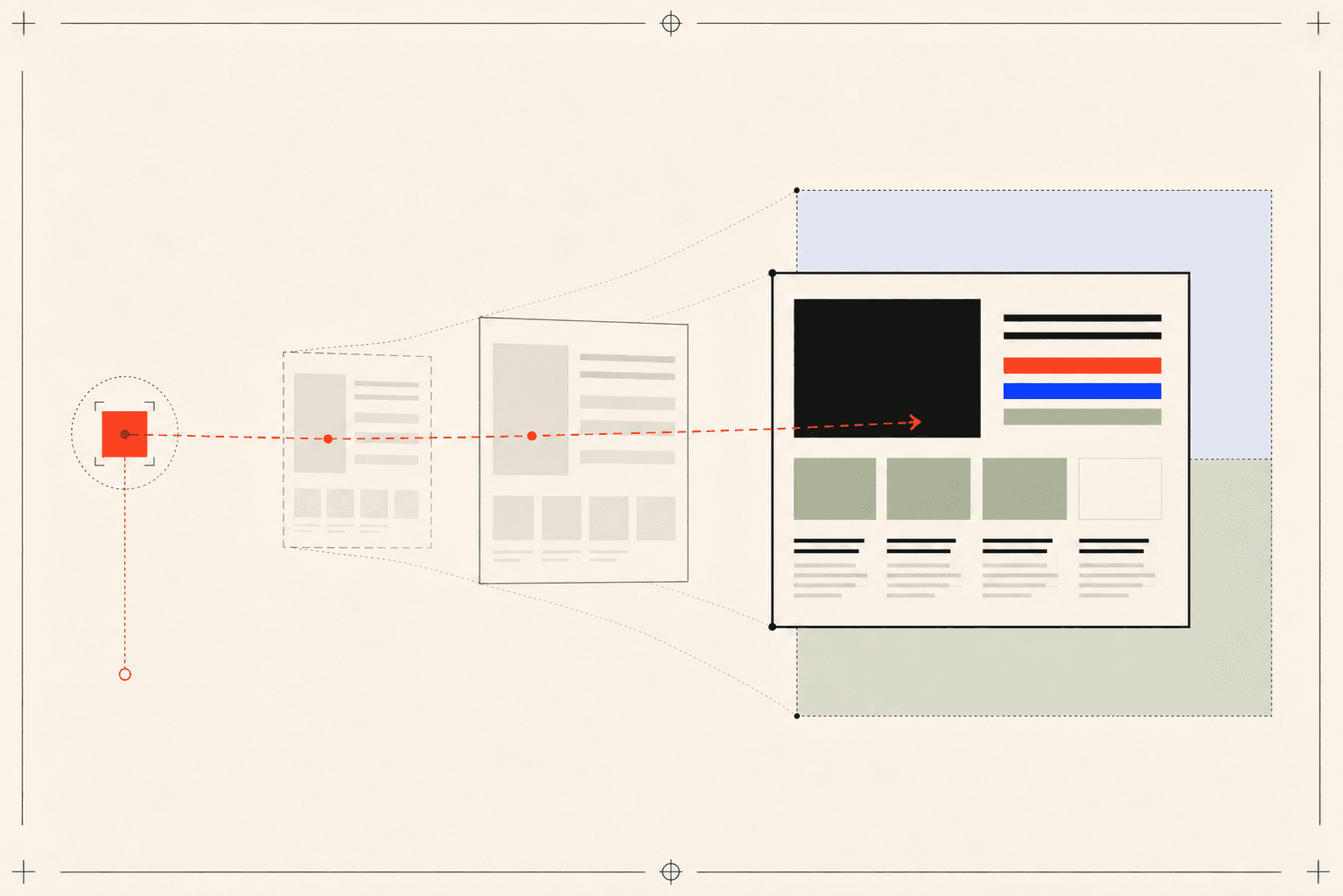
A good transition makes its beginning and destination legible together. When someone opens a card, the detail panel should appear to emerge from it. When they tap the menu, navigation should not arrive from an unrelated direction. Motion makes the relationship between two states visible and quietly answers the question: what just happened?
That is why I do not start an animation by choosing a duration or easing curve. I first write down which event causes which result. If the source, direction, and destination are not clear, a more explicit layout is often a better solution than adding movement.
Distance and duration should share the same hierarchy
A small arrow and a panel that changes the entire screen should not move with the same weight. Micro-feedback is short and direct. Content changes can be calmer. Large spatial changes, such as navigation, need enough movement to communicate direction. Distance, duration, and scope should support the importance of the element.
Consistency does not mean forcing everything into one duration. It means defining a small family of related rhythms. People never need to know the numbers, but they learn the behaviour: a signal is quick, a card transition is measured, and a panel movement is broader but controlled.

If everything moves, nothing leads
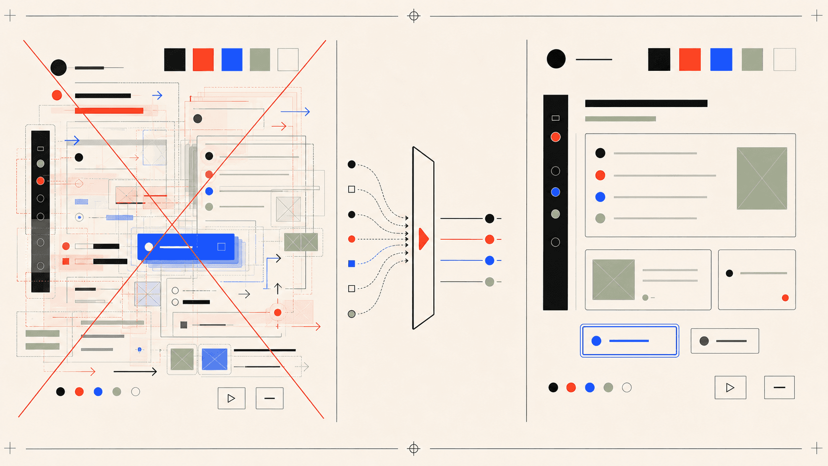
As animation becomes easier to add, the more important design decision is what to keep still. Sequential text reveals, cards that jump on every hover, and shapes that never stop moving may look lively at first. Over time they compete with the content, weaken direction, and make the interface harder to predict.
I prioritise movement that responds to a person's action. A page does not perform simply because it opened. A link indicates direction, a selected card gains depth, and an open menu moves focus into a new area. If meaning survives when an animation is removed, that movement was probably not needed.
Reduced motion is not a separate design
I do not treat prefers-reduced-motion as a safety switch added at the end. It is a calmer expression of the same information architecture. Large translations and scale changes can disappear while state remains clear through colour, line, opacity, or a direct content update.
I use one simple question to judge motion: does it provide direction, cause, or feedback? If it does, it belongs to the interface language. If the only answer is “it looks more impressive,” quiet is usually stronger.